Sunday, 12 December 2010

And Again....


I have changed all the camera angles and frames like I mentioned in the previous post. I really think it helps with how the animation looks as a whole.
However, I have actually now noticed that there are some touch ups needed in the animation.
In the run cycle, the back foot doesn't extend properly and the leg that hits the ground doesn't extend enough.
Also, after he turns round to start running, his back leg lifts then comes forward, when it should only come forward.

Apart from this I am now really happy about how this has turned out. I think despite it's flaws, its a pretty good first attempt at a 3D animation and I want to stop working on this and just continue with future projects that I can now see are possible due to what I have learnt in this project.

Saturday, 11 December 2010

Improvements

These are the ways in which I have decided need improvement, not in the animation, which I think I am very happy with, but in the post production - when I put the frames into i-stopmotion, and how I move the camera.

I-STOP MOTION EDITS (copy and paste frames so that they last longer - which saves on rendering time.)

- Pause before jumping

- Pause before turning round

- Pause for a bit longer before turning to run away

- Pause for a bit longer on the floor before getting up

- Pause before putting arm up to cover face.

CAMERA ANGLE EDITS

- Get a longer turning round shot of the turning from the first angle & a longer shot of him turning from the second angle - overlap the two cameras (two separate renders)

- Reposition the second shot so that he fits better in the frame.

- Just before he falls rotate the camera angle so that the falling shot and his pose can be seen better.

- Also shoot that shot from a few frames before & shoot the getting up and shaking his head shot for longer - overlap the two cameras.

- Reposition the final shot so that it zooms in better and that his head fits better in the frame.

Monday, 22 November 2010

Evaluation

Overall I am really happy with how my animation turned out. I think I was able to create some good character posing with good secondary animation, using the practice from my tests, and the video referencing that I took. I also think that the style in which I rendered it turned out to be very visually nice, and the colours really helped bring to life my character.

If given more time I think I would have re-rendered my animation and have worked on the camera angles. In some places, I'm not sure that the camera angles do the animation justice in some places, which is a shame, as I was quite happy with how he was animated.

I would also have added some sound effects to my final animation if there had been more time. I had had a look into various eerie background noises and the making of footsteps and making echos, but there wasn't time to add this to the animation, when then animation was the main focus of this project. I had looked at a program called Audacity, which is a program where you can edit the sound of your music file to create strange and wonderful effects.

Obviously one thing that I regret is not being able to successfully rig my character. It is a shame because she was very successful in the modelling part, but the rigging just wouldn't work.

SPECIALIST STUDY 2

In the next project, I want to make sure that every aspect of the animation or game is perfected to how I want it to turn out. I think I will have to manage my time a lot better, but I definitely need to practice rigging effectively so that I can animate my own 3D characters exactly how I envisage them. I will definitely add music next time for my final project, because I think that it really is the finishing touch to any animation or game, and really draws you into the scene or experience.

IN THE FUTURE...

At somepoint, I want to go back to this project and firstly, re-render my animated character with better camera angles that I feel show off my animation better, and also I would like to re-rig my designed character, so that she can also be animated in Maya as my own designed, rigged and animated character, as I really am fond of her design.

Final Animation


This is the final animation that I have created. I heavily relied on the video shots of my friend acting out my animatic for reference on the posing and the transitions of the animation. By looking at these I was able to get a better idea about timing each pose, and how best to capture the secondary action.

Because of the failed rig of my own character, I have used this downloaded rig that worked really well when animating it as a replacement. To pay homage to my own character, I have lit it and coloured him just like I would have my own character.

Lighting


These are some test lighting effects for the environment of my character. I have decided that by creating a white floor for my character to move on, her movement will become much more believable, as she has a place to stand on. I also think that the glowing white floor contrasts nicely with the colours of my character. Beacuse I have put toon shaders on the white feet of my character, even though both the feet and the floor are white, a shadow is cast on the character that makes sure it stands out. I am now glad that I have decided to keep the red arms instead, as these definitely would blend in with the background, due to their large surface area, which would make the animation very confusing to watch.


This is the finished lighting test of my character. I was attempting for ages to work out how to add a shadow in with the character, but eventually I just found the one button on the light source that fixed it... The shadow looks very effective because it makes sure that the character looks like she is standing on something - she is grounded to the floor, which helps create depth and a better idea of how she moves across a surface.

This colour scheme and lighting actually reminds me of Sin City - a film where it was mainly in very highly shadowed black and white, with splashes of colour that really stand out in comparison. It was made to look like the graphic novel it was made from - so it has a very toon-like style to it. I will try to create some nice shadows in a similar style, with my character being the colour part of the image that stands out - helping her poses stand out as she has all the focus of the shot.


Animation Tests

For these tests I have been looking at various run and walk cycles. I am really interested in the movement from Kingdom hearts. I like that Sora (the main character)'s run is very exaggerated in terms of how far the arms and legs reach forward, and how he looks very light on his feet.


I feel that I have emulated the movement quite effectively. I worked especially hard on the key frames, measuring the height of the model's poses up against Sora's. The Kingdom Hearts Run cycle is very bouncy, and has that old game appeal where they are animated to leap really far, but don't actually make it that far with each step. I think this was very common in old games where due to the very tiny pixel sprites, the animation was minimal, but I think this has been reproduced here as a mix between a homage to old games and exaggerated Disney animations.


This animation is a quick test with my downloaded test character, of him retreating in fear. I think that I have done this fairly effectively using the key frame shapes and timing the back steps well.


This animation is an extended version of the above one, to show a continuation of the movement of the character, and how the action of stepping back would result in the secondary action of the character moving forward. I think it is fairly effective, but I think I should probably make the transitions much quicker and more snappy, and have him hold the poses for slightly longer - this would emphasise the acting of the character, and let you focus on the body language a bit more.

Animatic


This is the animatic of my storyboard, just planning out the timing of the shots a bit better.

I have also taken videos of my friend acting out different clips from my storyboard so that I can have actual moving reference on how a character could move, while acting out my scene.


* UPDATE*

I have actually found these videos extremely useful in posing the key frames of my animated character. By pausing these videos I can see the shapes made by the body that I can transfer to my character to ensure good acting and effective secondary motion.

Narrative Storyboards

VAL LEWTON

Val Lewton was famous in his films for creating characters that would be chased, with the culprit being unknown. For example, In his movie, Cat People, you never see the cat creature at all, you are just given the illusion of it's existence through shadows and the acting of the other actors in the film. I want to use this theory to create a chase run cycle, where the character is clearly running away from something, but you are not clear about from what.


INITIAL STORYBOARDS


These first storyboards are a bit off in the way of timing and reactions that the character would have to what is happening. I want there to be a lot more stopping and posing, which will make the animation much more snappy and believable.

REVISED STORYBOARDS

After taking a look at my previous story boards, I have refined the different poses to try and get the best out of the emotions the character would be feeling, and how she should be acted out.


She looks around suspiciously...


Hears a noise and jumps at the sound.


Turns around slowly to look behind her.


Is shocked and jumps at what she sees, (which is off camera).


She immediately turns round and runs fast in the opposite direction.


As she is running she turns her body round to look behind her at what she is running from.

She turns back to focus on running away.

She begins to turn back to look once again at what is following her.

She falls flat over on her face.


She gradually lifts herself up and shakes her head.


She turns round slightly and realises that what is chasing her is still there.


The camera zooms into her face as she lifts her arm protectively across her face.


The screen quickly cuts to black....

Maya Model

I have documented the process of modelling my character in Maya. By first scanning in and importing the side and front views of my character, I can see how the proportions will be in the 3D modeling environment.
By using cylinders for each section of the body - arm, leg, torso..etc, I can line up the vertices in the side and front views to create a relatively exact model to my initial designs.


The model is first only half created, as it will be mirrored to create a complete image - saving you the time of modeling the other half separately, and also ensures that you are accurate when you create the other half of the model.


I have now modelled the hands, which consist of joining various shapes together by joining their vertices and then shaping them into a smoother, more natural looking shape to be fitted onto the rest of the body. The problem with fitting the hands on was that the ends of the arms were of a different shape to the ends of the hands, so the shapes of both had to be edited before the vertices could be joined. As I had already made the rest of the model, I could not just mirror the image to create a hand on the other side - I had to duplicate the image, delete the unwanted faces and delete part of the handless arm so that the mirrored duplicate of the hand could be attached. I deleted part of the arm also because of the editing of the vertices when I was attaching the arm, to both the arm and the hand. This way both arms and hands would be exactly the same.


TOON SHADING

I chose to create a toon shaded character, because I think it is a simple way to colour characters effectively, concentrating on the shapes of the character and their shadows. There are many types of toon shading, some taking on the form of a more cartoony style with outlines, others emphasising colour

RESEARCH:

I really like the colour scheme for this game - Madworld. Although the content is very gory, I think that the colour scheme, being similar to my characters, creates a really nice effect, where the red really stands out in comparison to the black and white backgrounds and characters. I will perhaps use a similar colour scheme to have my red character stand out and have her poses be the focus of the animation.

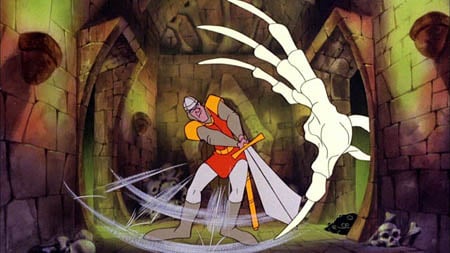
This is an interesting game called dragon's lair, which is effectively a completely tooned game. Due to the restrictions of the consoles at the time (1983), most games designers had to make do with very simple, sprite animation. This game, was instead put on laserdisk, which adversely affected the gameplay, but made it a visually beautiful toon game - and one of the first to be released.


Another World is a visually stunning cinematic platforming game, which was possibly the first of its kind to create a tooned world, and with cut scenes to such a high cinematic level. The shading in the pixels were extremely detailed, and the colours were clear and blocky. Ignoring the pixeld nature of the game, I really like the subtle colours that are built up to create a beautiful scene, expecially at such an early time in the gaming world.


This game is called Fear Effect, which is a really nicely and simply toon shaded game. The colours have nice subtle shadows on them that really bring the characters even more so into a 3D world.

This game is called Okami, and has a very interesting art style - everything looks like a Japanese watercolour painting due to the thick, varied outlines and soft pastel colour scheme. It is very beautiful, but I think something like this would be too distracting for my animation.

Paper Mario - This style is very cartoony - a bit too cartoony for the style i'm looking for, but I really like the defined colours, and the outlines make everything look completely 2D in a 3D environment, which I think is a really interesting style.


Ilove the colouring for this game. The toon shaded red shadows look particularly effective and work really nicely with the light. - Killer 7


This game - Zelda Windwaker, in particular has the kind of toon shading that I want to represent in my character. The colours are bold and clearly separated, which allows the colouring to emphasise the shape and the posing of the character.

TESTS


White arms test - I have rendered my character with her white arms as previously designed, but I think that in Maya these look a bit strange, and seem to be too big for the body. I have therefore changed her arms so they are just red, which seems to be a better balance for the character.


In the render below I have been playing around more with shadow on the toon shaded effects, and I have found that by adding black to the colours added to the toon shader, I can create some really nice shadow effects over the body of my character, which really emphasises the shape and pose that she is in - it gives more depth to the image. This final test of the toon shading has simple blocky colours, just like the Zelda Windwaker graphics, which creates a simple, yet defined colouring scheme for my character.


RIGGING

I have attempted to Rig my model, but it has proved to be very difficult. I started off by creating a skeleton for the model to move with. By creating an extra joint in the wrist, I can have better control over the hand movements. Also, with an extra joint in the hood I can animate that as the character moves also.

A test pose after a soft Bind:


Screenshots of how I was rigging the skeleton of my character, including controllers so that she would move properly.


This is a test after rigging my character. Unfortnatelly, it really hasn't turned out well, and distorts horribly... I really can't work out why. The hood distorts when you rotate the arms, the crotch area's polygons turn into weird angular shapes and the right arm just seems to be constantly extended. I have decided to attempt Paint Weighting, which was suggested to me after I showed some friends my rig.

PAINT WEIGHTING

Paint weighting is where you paint specific areas of the model to control how each part of the model is distorted as you move the rig. This helps create better muscle structures, and stops strange polygon shapes appearing as you try to animate a model.


This is a test after trying to fix my model with paint weighting. The hood distortion is a little better, but I cannot work out the problem with the arm. Unfortunately, due to time constraints, and how much I have been struggling to rig this model, I will have to rely on a downloaded rig that I have used for testing to create my final animation.

Maquette

These are quick plasticine models of my character that I made before modelling her in Maya. This way I can work out how best to shape her body in 3D, instead of just hving to work with a 2D image. I can use these to best work out the proportions and the curves to create a well made modek.